Behind the Polls: Understanding Public Sentiment
 With election polling currently at a fever pitch, we’ve developed a three-part series designed to aid in understanding, interpreting, and utilizing survey data. This post is the second in this series.
In Part 1 of our series, we explored the strengths and limitations of surveys: how they can provide valuable insights but also how they can fall short in capturing the full picture. Now, we’re diving deeper into a specific type of survey data that many people are already familiar with: public opinion polls. Especially right now, public opinion data is everywhere — reported in headlines, debated on social media, and analyzed in think tanks.
Public opinion polls are a unique subset of survey data because they aim to measure not just individual behaviors or experiences, but the collective mood of a population. They’re widely used to gauge public sentiment on a range of issues, from political candidates to policy preferences. While most of us encounter this data in the form of electoral polling, there’s much more to public opinion research than predicting the outcome of the next election. It’s an essential tool for advocacy, helping us understand how different groups think and feel about the issues we care about.
In this post, we’ll break down what makes public opinion data special, how it’s collected, and how to interpret it beyond the surface-level results we see in the news. We’ll also explore the common misconceptions and challenges that come with using polls to inform our communication strategies, helping you navigate the data with more confidence and clarity.
The Anatomy of a Poll
Behind every public opinion poll is a methodical process designed to ensure that the data is both reliable and reflective of the population being studied. While polls may seem straightforward — just ask a group of people what they think — the reality is that conducting an accurate poll involves a series of careful steps. Let’s take a closer look at some key elements that make up the anatomy of a poll: the sample, the margin of error, and the questions themselves.
Sampling: Who gets asked?
Sampling is at the heart of any poll. Think of it like selecting ingredients for a recipe — you want the right mix to ensure the final dish turns out as intended. In the context of polling, that “right mix” means choosing a group of respondents who accurately represent the broader population you’re trying to study.
Random sampling is the gold standard for polling because it gives everyone in the population an equal chance of being selected, just like drawing names from a hat. (See Part 1 of this series for more on sampling, including an explanation of the difference between random and non-random sampling.) When done correctly, random sampling helps prevent bias and ensures that your results can be generalized to the entire population. Pollsters typically aim for a sample size of at least 1,000 participants, which strikes a balance between cost and accuracy. A larger sample increases confidence in the results, while too small a sample risks producing misleading data.
A word on weighting
Even with random sampling, no poll is perfect. Some groups of people may be overrepresented or underrepresented in the sample — maybe too many people from urban areas responded, or not enough young people participated. To address this, pollsters use a technique called weighting.

Pollsters use weighting to ensure that the final results are more aligned with the population at large.
Weighting is like recalibrating a scale. It adjusts the results to better reflect the demographic makeup of the population. For instance, if your sample includes too many college-educated respondents, you might “weight” their responses down, while giving more weight to underrepresented groups. This process ensures that the final results are more accurate and aligned with the population at large.
Think of weighting as making sure all voices are heard equally. Without it, certain groups could dominate the results, skewing the data and making the poll less useful for understanding broader public sentiment.
Margin of error: Embracing uncertainty
Polls can tell us a lot about what people think — but no poll is ever 100% accurate. The margin of error is a way of acknowledging that uncertainty. It tells us how much wiggle room there is in the results, based on the sample size and methodology used.
For example, if a poll shows that 50% of people support a certain candidate with a margin of error of ±3%, the real level of support could be anywhere between 47% and 53%. The larger the sample size, the smaller the margin of error, because more responses provide a clearer picture of the population’s true opinions. Think of the margin of error as the pollster’s way of saying, “We’re pretty sure we got it right, but there’s a small chance the real answer could be a little higher or lower.”
When interpreting poll results, always keep the margin of error in mind. It’s easy to take numbers at face value, but understanding the built-in uncertainty will give you a more accurate sense of the reliability of the data.
Question wording: The subtle art of asking the right questions
Polling isn’t just about who gets asked. It’s also about how you ask the questions and phrase the responses. A well-designed poll uses neutral, non-leading language to avoid pushing respondents toward a particular answer.
For example, in recent polling on Americans’ views of Palestinians, respondents tend to say their sympathies lie more with Israelis than with Palestinians when forced to choose (i.e., to compare groups), as in this Quinnipiac poll from November 2023. However, when asked about each group on their own (i.e., not forced to compare), majorities have said they sympathize with Israelis as well as Palestinians, as in this Reuters/Ipsos poll from the same time period.
Interpreting polls: Reading between the numbers
Polling data can provide a wealth of information, but understanding how to interpret it correctly is crucial. Polls may give us eye-catching numbers, but those figures are just the beginning of the story. To truly grasp what polls are telling us, we need to dig deeper and ask critical questions. Let’s explore how to go beyond surface-level data and uncover the insights that really matter.
Break it down: Look at subgroups for a clearer picture
One of the most valuable aspects of polling is its ability to reveal differences between groups within the broader population. A poll may show that 60% of respondents support a policy, but what happens when you break those numbers down by age, race, gender, or geographic region? You might discover that younger people are overwhelmingly in favor of the policy, while older generations are split.
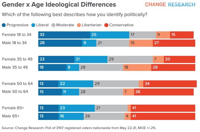
For example, you’ve probably heard that young people are more liberal than older folks, as in this Change Research poll from May 2023 finding that 48% of Americans aged 18-34 identify as liberal or progressive, compared to about 33% of Americans over 34. However, a look at the gender breakdown shows that it’s young women who are really driving this leftward lean for young people, with 58% of young women identifying as liberal or progressive vs. 37% of young men.

With this subgroup analysis, the data suddenly becomes more actionable, highlighting an opportunity to target young women or educate older demographics. Polls are most powerful when you explore these subgroups to uncover who is driving the trends and why.
Correlation doesn’t equal causation: Be cautious with connections
Sometimes, polling data will show two sets of numbers that seem connected — for instance, people who attend religious services might also have higher rates of political engagement. But it’s important to remember that correlation does not equal causation. Just because two things occur together doesn’t mean one causes the other.
In polling, we often see relationships that are influenced by other factors. For example, if voter turnout is higher among certain racial or ethnic groups, it’s not their race itself that causes the turnout; instead, it might be connected to factors like historical voter suppression or increased mobilization efforts within their communities. Always look for the root causes behind correlations, rather than assuming a direct cause-and-effect relationship.
Beware of snapshot thinking: Polls capture a moment, not a movement
Polls are a snapshot in time — they reflect public sentiment at a particular moment but don’t necessarily predict the future. A poll might show strong support for a policy or candidate today, but opinions can shift rapidly, especially in response to new events, media coverage, or emerging information.
For instance, a poll taken before a major national event might show one result, but the same poll conducted afterward could reveal drastically different opinions. Recognizing that polls are subject to change helps prevent overconfidence in their predictive power. Always consider the broader context and keep an eye on how trends evolve over time.
Wrapping it all up: Polls capture a snapshot, not the whole picture
Ultimately,opinion polls are snapshots of the public’s views at a given moment, not definitive predictors of the future. By understanding the methodology behind them, and reading between the numbers, we can turn polling data into actionable insights that guide advocacy and strategic communications.
In the upcoming final post of this series, we’ll dive into how survey data can be transformed into powerful messaging strategies, tailored to resonate with specific audiences. We’ll also explore how this data can be effectively used to capture media attention and advance advocacy efforts. Stay tuned for insights on how to maximize the impact of your survey results to amplify your cause!
For more information about survey methods and interpretation, please reach out to ReThink Media’s Research & Analysis Team at analysis@rethinkmedia.org.


