Post-Election Data Download, Appendix: Establishing the Facts
We will refer to this post a few times throughout our series on the 2016 Election.
Turnout Numbers
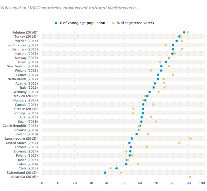
The United States is infamous for its low voter participation. Unlike many other modern republics—Australia and Turkey among them—and much to their citizens’ surprise, we do not have compulsory voting. Pew Research Center ranked the US 31 out of 35 countries.
There are a few ways to measure turnout rates. It doesn’t make much sense to put the total US population in the denominator because of all the children, but many people calculate it using citizen voting age population (CVAP), which was about 251 million in 2016 (source: Election Project).
It’s more accurate, though, to use the voting-eligible population (VEP) as the denominator, as this excludes convicted felons, current prisoners, and others whose right to vote has been removed by society. In 2016, this number was about 231.5 million (Election Project).
The best estimate I could find of registered voters in 2016, was about 200 million (source: NY Mag), or 86% of VEP.
As of 12/1/16, total turnout in 2016 was estimated at 135.7 million (Election Project). This would be 67.8% of registered voters, and only 58.6% of VEP.
We still do not have a final count of the total ballots cast for president. It will be interesting to compare this rate to previous presidential elections to see if it’s lower than usual—we expect it might be, given how low public opinion was for both candidates.
This year, the total early vote—made up of early in-person voting plus mail ballots (absentee in many states, all vote-by-mail in others)—was 47 million (Election Project), or 35% of total votes. This proportion has been steadily rising over the last two decades.
If we had no electoral college, Hillary Clinton would have won the presidency by roughly 2.3 million votes (as of 12/1/16). But when they vote on December 19, they will almost certainly vote 290–228 in favor of Trump.
What is Normal?
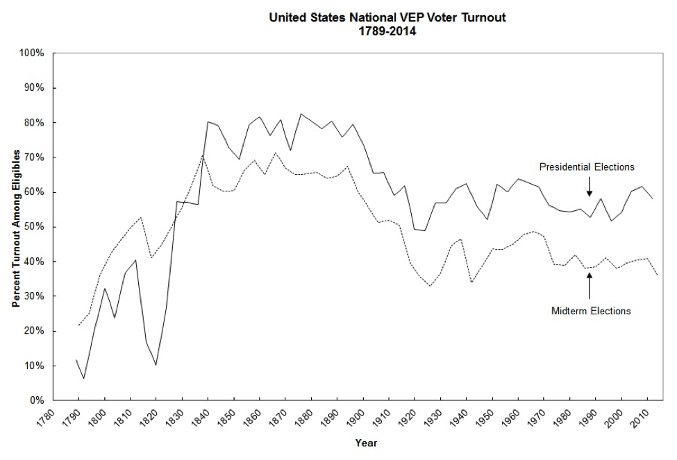
One of the startling things about this election is that it defied prediction. We’ll discuss where pollsters and journalists went right and wrong later in the series, but here we want to establish a baseline. How did this election’s numbers compare to previous elections? In the end, was it unusual?
Turnout (from Election Project):
2016 turnout was well within the range of the last 30 years, although it feels low compared to more recent elections:
| Year | % VEP | % Early | % Registered | Total Prez Votes |
|---|---|---|---|---|
| 2016 | 58.6% | 35% | 68% | (135.7 M ballots) |
| 2012 | 58.6 | 24.8 | 70.0 | 129 million |
| 2008 | 61.6 | 23.7 | 73.5 | 131 million |
| 2004 | 60.1 | 22.5 | 71.0 | 122 million |
| 2000 | 54.2 | (unknown) | 68.0 | 105 million |
(data compiled from The Election Project, US Census, and Early Voting Information Center)
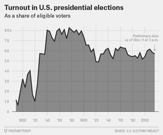
FiveThirtyEight has a different chart of the same data, which shows even more clearly the turnout rates of the last century.
FiveThirtyEight has found that the drop in turnout this year over 2012 and 2008 was uneven:
“On average, turnout was unchanged in states that voted for Trump, while it fell by an average of 2.3 percentage points in states that voted for Clinton. Relatedly, turnout was higher in competitive states—most of which Trump won. In the 14 swing states — those where either the winning party in the presidential race switched from 2012 or where the margin was within 5 percentage points — an average of 65.3 percent of eligible voters cast ballots. In the other 36 states and Washington, D.C., turnout averaged just 56.3 percent.1 That gap exacerbates a tendency for turnout to be higher in the places where candidates concentrate their travel, advertising and other get-out-the-vote efforts.”
So what is “normal” turnout? Looking at the last couple of decades, I’d say it’s somewhere in the range of 50-60% of the voting-eligible population (VEP). It’s conceivable that we could boost participation through a series of reforms—among them, making Election Day a national holiday; removing systemic barriers to voting; normalizing participation amongst younger voters; enabling young people to register before they turn 18. There is serious opposition to each of those ideas, particularly from the right (who do not benefit as much as the left), and it takes time to change social norms even when barriers are removed. So we can probably expect participation in that range for the next few elections.
Demographics
We have a data problem when it comes to answering demographic questions, because the best dataset we have available right now is the national exit poll, conducted by Edison Research on behalf of the National Election Pool (ABC, CBS, NBC, CNN, Fox, AP). But Edison is like the Nielsen Company: there are methodological problems with the way Edison conducts its research, and an overall lack of transparency about the dataset—both to the journalists reporting on its numbers and the general public consuming them. (Read more about how it’s conducted at Pew’s site.)
Vote Choice
One of the biggest problems with the exit poll is that it probably doesn’t do a good job of accurately polling people of color. This year, there are persistent questions about the Hispanic vote: according to the exit poll, 29% of Hispanic voters went for Trump, but groups like the polling firm Latino Decisions have cried foul:
“the national polling miss was only around 1-2% compared to what the popular vote margin will eventually be. These Latino numbers are off by 10-15%. That requires a plausible explanation, and secret support for a man who described Latinos as rapists and criminals does not pass the sniff test. …We suggest that if the Exit Poll numbers seem inexplicable, maybe they are wrong.”
So, when will we have better demographic numbers? We will have more demographic data from two sources: the American Community Survey, conducted by the Census Bureau each year and released late in the following year; and the American National Election Study, conducted in a pre- and post-election phase and released sometime early in the following year. Each of these does a much better job of accurately examining demographic groups—but both suffer from voting over-reporting (the latter more than the former).
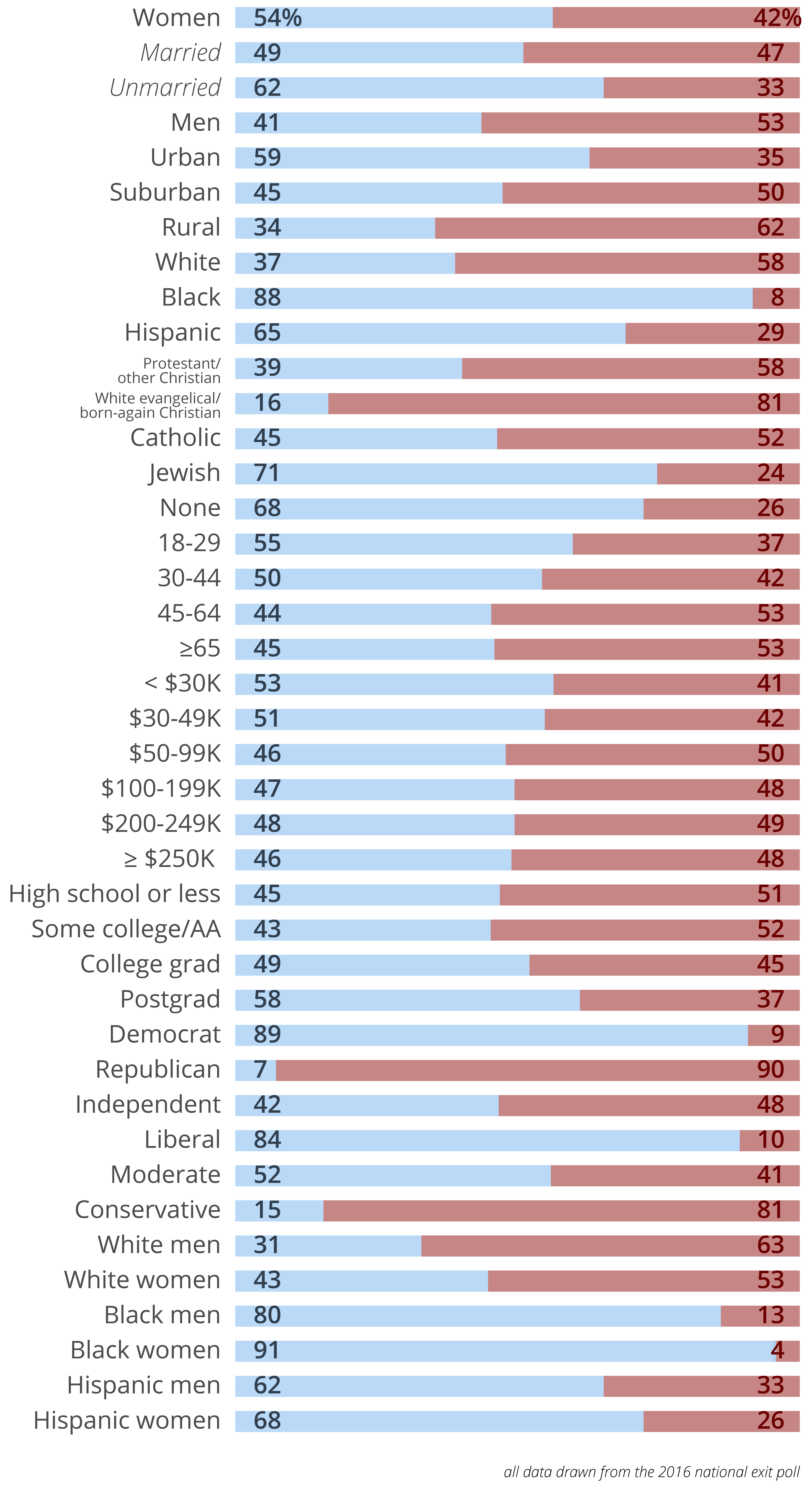
In the meantime, what can we tell from the (not great) data we have right now? Here’s what we know from the National Exit Poll, expressed in Clinton–Trump%.
Turnout
The other piece of the demographic puzzle is turnout: which groups voted and which stayed home. Here we face the same demographic problems with the exit poll, and it will be a while (see above) until we have real numbers to discuss on whether there was a “Latino surge” or a Black turnout failure or whether young voters did what they usually do (stay home).
However, there are some interesting things to think about when it comes to turnout trends among various demographic groups.
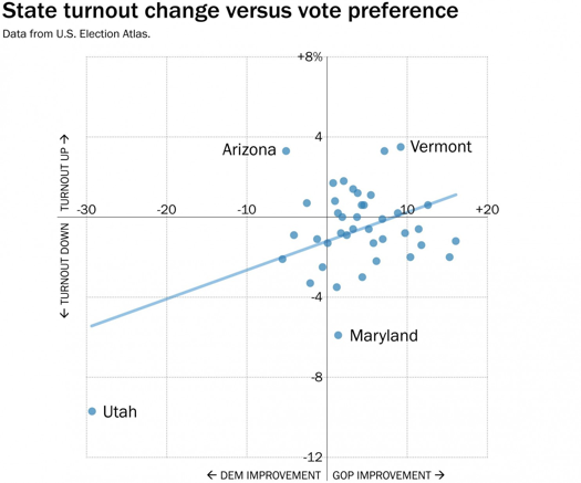
First, here’s a lovely plot from WaPo showing changes in turnout and party preference from 2012 to 2016, by state. It “suggests that there was a slight correlation between the change in how a state voted and its turnout, with states seeing more turnout since 2012 voting more heavily Republican.”
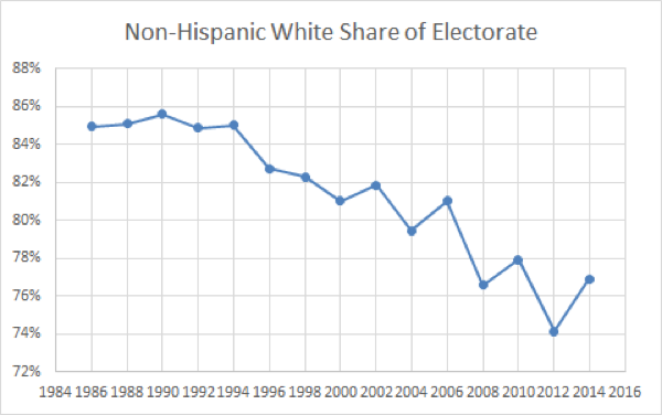
This chart, from Michael McDonald’s Election Project page about demographics, is revelatory when discussing turnout by race. In the last thirty years, the white share of the electorate (once around 85%) has steadily declined to roughly 75%.
Alongside that development is a more interesting one, also visible in this chart: the line becomes more jagged as we move forward in time because mid-term and presidential swings have intensified. White citizens have a higher rate of participation in off-year elections than citizens of color, so they make up a larger share of the electorate in those years, and that is much more the case now than it was in the 80s—as participation rates among non-whites have increased. Basically, what this chart is demonstrating is the gravitational wobble caused by an unseen planet.
(Note that the Y-axis scale on this chart is altered (“zoomed”) so that the actual changes are visible. But that means that we’re trusting deeply in the veracity of each year’s numbers, and there’s reason to at least be cautious on that front. The dataset for this chart is drawn from the CPS, corrected for vote over-report and non-response errors.)
