What Nonprofits Can Learn (and Steal) from Brands’ Twitter Cover Photos
We’ve talked about what to put in your own Twitter profile to look like an expert, but it can also be helpful to see examples from the corporate world and steal some of their best ideas.
Luckily, the HubSpot Marketing Blog helped us out by curating 23 Brilliant Twitter Cover Photos from Brands. All of their examples are high-quality, beautifully designed, engaging cover photos. Some of them are more relevant to our work than others.
We took the liberty of pulling out some of their best examples and what we can learn from them.
Use Your Twitter Cover Photo to Promote Your Other Social Media Channels
Two of HubSpot’s examples highlight brands that used the prime real estate of their Twitter cover photos to promote their other social media channels.
While they have the same goal in mind, they take slightly different tactics. Both are effective.
British Airways, in addition to using a simple, but high-resolution photo of one of their jets as their cover photo (a no-brainer for them), subtly added the usernames and icons for their other social media channels. It’s non-obtrusive, but clear and useful.

Our only critique is that the airline’s avatar (profile picture) covers up some of these accounts. Users can always click the cover photo to see the unobstructed view, but that’s a tall order for casual users. It would be better to redesign the cover photo to take into account and avoid the avatar. (And free tools like Canva can help you design the cover photo with the avatar in mind!)
But overall, this strategy is very easy for nonprofits in the ReThink Media community to employ.
CNN similarly uses the high-value real estate of the Twitter cover photo to showcase their other social platforms.
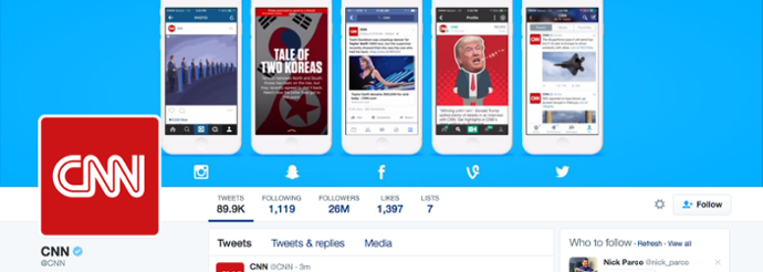
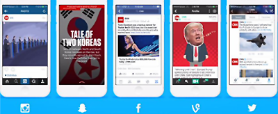
CNN uses imagery to emphasize accessing these social accounts via mobile, since so much of news consumption now takes place on mobile phones. CNN uses the logos for each of the social platforms below an image of viewing that platform on a mobile phone.
This also helps showcase to potential users what content they can expect on each of these platforms. For instance, it’s not surprising that the Snapchat content looks edgier and more designed than CNN’s Twitter content, or that the Instagram and Vine content favors large visuals.
For nonprofits to try this tactic, they need to ensure that the images are high enough quality and that the content on each social media platform differs enough to justify showcasing multiple platforms. (And yes, CNN has a higher quantity of content than most of our groups could reasonably put out, and sufficient staffing to populate all of these different social media channels.)
But it’s still an attractive, effective visual to ensure that Twitter followers will also check out the given organization on other platforms.
For example, the Arms Control Association does this well while promoting its new mobile app in its Twitter cover photo:
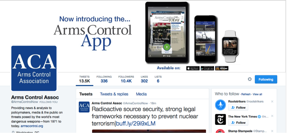
The cover photo shows what the app looks like on tablet, smartphone, and Apple watch, as well as conveys to users where to download the app. A job well done!
Use Your Twitter Cover Photo to Showcase Your Value Proposition or Mission Statement
Animoto, a site that helps users easily create video content, uses their Twitter cover photo to help explain what it is they do. While they also do this in their Twitter bio, they are able to quickly emphasize their value proposition in a visual way in the cover photo.
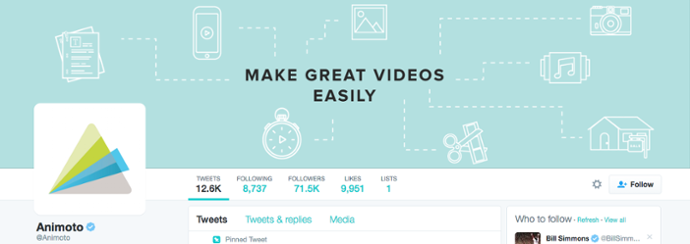
Nonprofits can consider similarly using their cover photo to showcase their mission statements, whether it’s arguing before the Supreme Court or firing up We, the People.
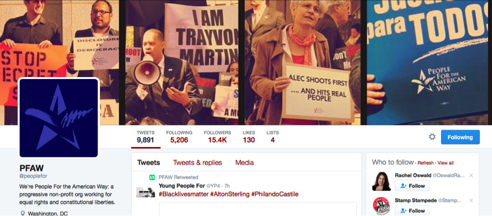
They can also use the cover photo to share the issues the organization works on, like People For the American Way does in its cover photo.
Free Speech for People and the Center for Responsive Politics also use their cover photos to nicely emphasize their value proposition:
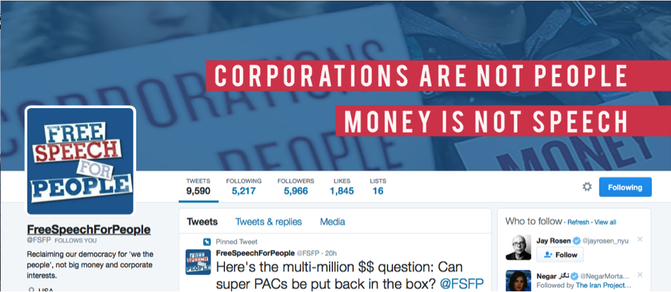
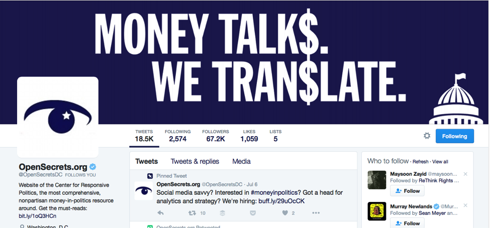
Another thing these cover photos do well is that they are designed with the Twitter avatar in mind. While the avatar occupies space on the left side of the screen, the cover photos are more heavily weighted toward the right, bringing a nice visual balance to the account’s appearance.
A highly visual cover photo is a great way to display an organization’s mission statement, value proposition, and unique positioning in the nonprofit world.
Use Your Twitter Cover Photo to Promote a Specific Campaign
A fantastic way to use your Twitter cover photo is to promote a specific campaign. This helps bring attention to the campaign by using the high-profile real estate, as well as providing ways to update and refresh the content frequently from campaign to campaign.
The HubSpot post includes this example from Vodaphone, saying, “Vodafone cleverly includes a hashtag for one of their campaigns in their cover photo to draw interest and drive engagement. Aside from the hashtag, the image maintains a consistent color scheme, especially with the reds and whites of its logo. Notice, for example, that the chairs in the photo have a red-and-white striped pattern.”

Nonprofits that work with ReThink Media have also utilized the cover photo well this way.
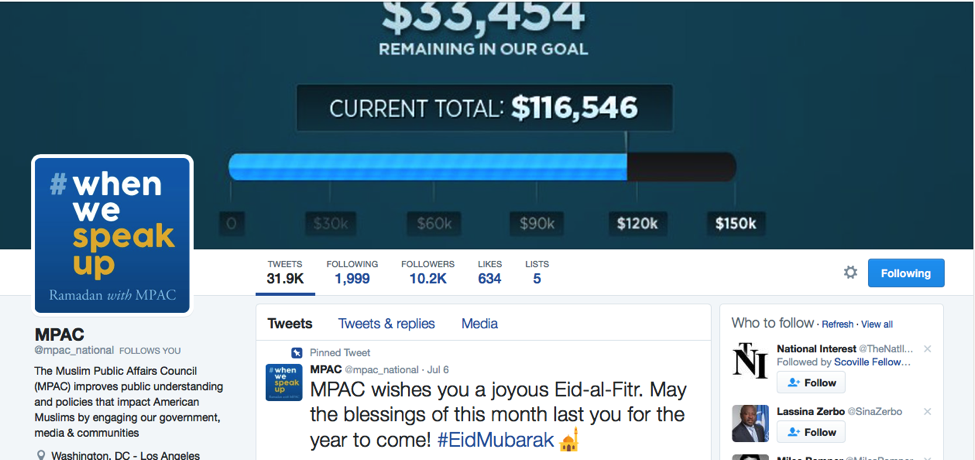
For example, the Muslim Public Affairs Council (MPAC) uses its Twitter cover photo to emphasize a fundraising campaign. When the campaign is over, MPAC will switch out its cover photo to promote its next campaign. But in the meantime, it is using this valuable space to inform followers about the campaign and subtly encourage them to contribute.
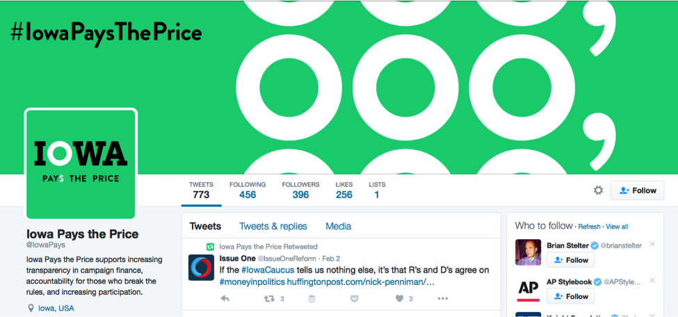
And Iowa Pays the Price manages to work its campaign hashtag into its Twitter cover photo – an easy way to reinforce to followers which hashtag to use.
What are other good ways to use your Twitter cover photo, and which organizations have you seen using it best? Let us know!
SaveSave
SaveSave


